Your Secret Weapon for Achieving WCAG Superhero Status
Web accessibility is all about ensuring equal access to information on the web for individuals with disabilities. WCAG (Web Content Accessibility Guidelines) standards play a crucial role in achieving this by providing guidelines for designing and maintaining accessible websites. Here, we’ll zero in on one major aspect of accessibility when it comes to high fidelity designs, color contrast.
Color contrast refers to the difference in hue, saturation, or luminance[1] between two elements, such as text and its background. It provides visual clarity and legibility, allowing people with various degrees of low vision, color blindness, or other visual impairments to perceive and comprehend information effectively. As it’s an often overlooked aspect of web design, it’s important to keep this in mind when declaring your primary, secondary, and tertiary colors in your style guide.
Enter color contrast checkers, the unsung heroes of WCAG compliance. These neat little tools have the power to ensure that everyone can access and navigate websites with ease. In this action-packed article, we’ll unveil the hidden secrets of color contrast checkers and show you how to become an accessibility champion!
Before our tools swoop in for the rescue, let’s add in a little context in understanding WCAG Color Contrast Guidelines. The requirements are categorized into three levels: Level A, Level AA, and Level AAA. Level AA is considered the standard for most websites and is widely adopted to meet basic accessibility standards. However, when you suit up with Level AAA, you’ll gain a higher level of accessibility, which is recommended for situations where maximum accessibility is desired. The two most common WCAG success criteria related to color contrast are 1.4.3 Contrast (Minimum) and 1.4.11 Non-text Contrast.
The WCAG success criterion (1.4.3) focuses on the minimum contrast ratio between text and its background. It sets a standard for ensuring that text content maintains sufficient contrast with the background color to be easily readable. The contrast ratio is calculated based on the relative luminance of the foreground (ie: text) and background colors. The minimum contrast ratio required for Level AA compliance is 4.5:1 for normal text and 3:1 for large text (typically above 18pt or 14pt, if bolded).
WCAG success criterion (1.4.11) addresses the contrast between non-text elements, such as icons, graphical symbols, or user interface components, and their background. Non-text elements often serve important functional or navigational purposes, and sufficient contrast is necessary to make them discernible and understandable. This criterion ensures that non-text elements have a contrast ratio of at least 3:1 with their adjacent background. However, there are exceptions for decorative graphics that don’t convey information or don’t receive user input.
Now back to our regularly scheduled programming. Color contrast tools will fly in with instant contrast calculation, provide pass/fail indicators based on the WCAG requirements, and offer recommendations for improving color contrast with alternatives. Some color contrast checkers simulate the experience of individuals with various visual impairments, such as color blindness or low vision. Using color contrast tools in the design phase will save tons of time during the development and QA phase of your project before discovering that your primary and secondary colors don’t meet the minimum requirement. This means development presses on but your declared colors are going back to the design drawing board and this could ultimately slam the breaks on your project.
There are a multitude of contrast checkers online. Here’s my personal top 5 (in no particular order):
WebAIM’s Contrast Checker
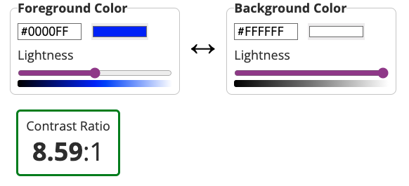
WebAIM’s Contrast Checker is a bit of a gold standard but isn’t winning the key to the city due to its early aughts design. That being said, it gets the job done and it gets it done well. It allows users to input specific foreground and background colors and provides instant feedback on the contrast ratio. The results are displayed with clear pass/fail indicators based on WCAG color contrast requirements.
Stark
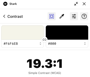
Stark (no relation to Tony) is a popular design accessibility plugin that includes a color contrast checker among its features. It integrates with design software like Sketch, Adobe XD, and Figma, allowing designers to check color contrast directly within their design workflows. It’s also available as a Chrome extension. Stark provides real-time feedback on contrast ratios and compliance with accessibility standards. While it does offer suggestions for improving color contrast, this is a feature of the Pro version, which is $10 a month.
Eightshapes Contrast Grid
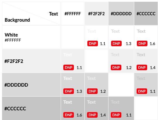
This color contrast grid is fire and a favorite on this list! 🔥 It can be a little intimidating at first but it’s actually super helpful. A major pro of this checker is because it’s a grid, you can test multiple colors at a time and each column and row intersection will provide a fail or level of accessibility indicator. You can test all your brand colors in one go! In the text box on the left side of the grid, you can change color hex values and names and they’ll appear in the grid.
Colorable
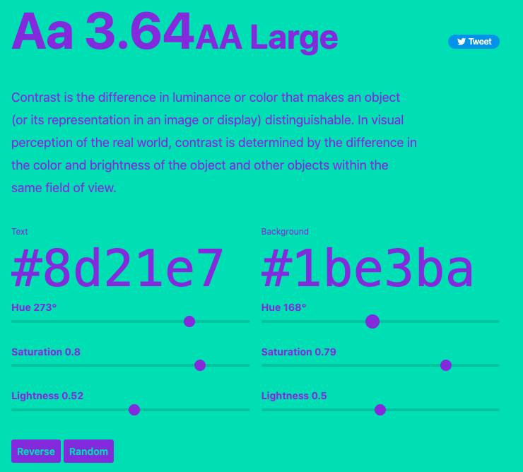
Colorable’s color contrast app will show you the contrast ratio value and accessibility level in real time as you slide the hue, saturation, and lightness ranges. This app features a reverse button that swaps out the background and text color and a randomizer button that will give you a random text and background color pair.
Coolors
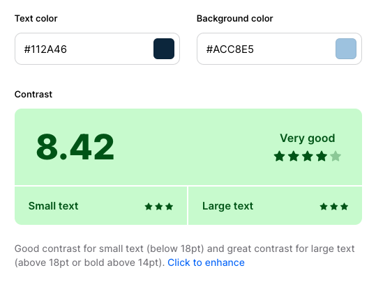
Coolors’ Contrast checker is similar in functionality to Colorable with some super charged features. It offers a color picker you can use to pick any color from the page and gives a breakdown for both small and large text. Down side, it doesn’t show the accessibility level. Up side, Coolors will generate a fun, inspiring quote to illustrate what block text will look like with your chosen colors.
Power up with each of these and see which one suits your needs best. Think of different use cases and scenarios when testing for contrast. Boost your site for accessibility by covering all cases and various factors such as text size, background images, dynamic content, and error states. For example, make sure your text is readable and of the proper contrast when you have display text over an image, especially an image with a wide range of color variants.
To keep your accessibility skills razor sharp, it’s essential to stay on top of updates to the WCAG guidelines. The best resources for this is the Web Accessibility Initiative (WAI) and the WCAG official documentation. Be sure to revisit your contrast checker of choice to ensure continued compliance with evolving WCAG requirements.
By prioritizing accessibility and adhering to WCAG standards, we can build websites that are inclusive, user-friendly, and empower everyone to fully engage with the digital world.
Footnotes:
[1] Want to better understand the difference hue, saturation, and luminosity? This post by Amit Agarwal (@labnol) has the best explanation I’ve ever seen with a video by Bruce Gabrielle (@speakingppt)
