Michele Cheow

Turning caffeinated beverages into code since '07

  • About
  • Portfolio
  • Projects
  • Blog
  • Connect

Check My Ads

March 25, 2024 by mcheow Leave a Comment

Filed Under: Portfolio

CSS :has() Pseudo Class

January 5, 2024 by mcheow Leave a Comment

#CSS has really come a long way since I started out :mumble, mumble: years ago.

In continuing my CSS news series, the latest update that has me and other front end devs buzzing is the new :has() pseudo-class.

It looks something like this if you’re looking to target a parent/child combo: .parent:has(.child){}

or if you’re looking to target a sibling using the sibling combinator:
h1:has(+ h2){}

Lots of us, myself included, are calling it a “parent selector”, which we’ve been asking for for years.

But this is selling it a bit short. Based on MDN docs,”this pseudo-class presents a way of selecting a parent element or a previous sibling element with respect to a reference element by taking a relative selector list as an argument.” So it’s more of a relational selector, not just a parent selector. (https://lnkd.in/gP79APH5)

This week, I just so happened to use this new feature to target a child/parent combo and it worked flawlessly in Chrome… but failed in Firefox, a browser MDN currently flags as a browser that doesn’t support this pseudo-class.

I was running an older version of Firefox, updated it, and :has() worked just fine.

Perhaps this might be concerning but my older version of Firefox was v115, 2.21% of global usage.

Caniuse.com indicates it has over 90% support so I think it’s safe to use in modern browsers. (https://lnkd.in/gFt_E4_R)

What do you think? Would you use this new pseudo class in production?

What new css features have you played with recently?

Filed Under: Uncategorized

Piss Off, 2023

January 1, 2024 by mcheow Leave a Comment

A few days ago, I felt like a full 12 months went by and I had nothing to show for it, I’m a huge failure, I’d have to start my career over.

So I decided to hold down the couch watching hours of Degrassi.

There were a lot of “shoulds” rolling around in my head and if I’ve learned anything from therapy, ‘should’ is a 4 letter word.

“I’m almost 40, I should be more stable in my career.”

“I should be more financially stable.”

“I should not have tried to take on everything and burn myself out.”

But I do have something to show for the last 6 months.

I learned a ton, I met some amazing people on LinkedIn, I came up with a lot of ideas for things I want to build, I had multiple interviews, including Amazon, I found a passion for design with Canva, and I started freelancing.

I learned my life isn’t over because I was let go. It’s full of possibilities.

I have plans in place to keep learning, focusing on React, Next, headless WordPress, modern JS architecture and DSA. And I will only be taking on projects that I’m interested in.

But first… to re-write my resume for the 4th time in 6 months.

I don’t know what next year will look like but we can always course correct, learn from our mistakes, and know there’s nothing wrong with starting over.

So let’s bid adieu to this absolute dumpster fire of a year a la John Oliver.

Happy New Year! Here’s to 2024! May it be better than this one!

(Psst… 2024 is a Presidential election year)

Aw, fuuuu….

:: cue ‘Curb Your Enthusiasm’ theme ::

(Image courtesy of Adobe Firefly, prompt was ‘John Oliver explodes the year 2023 in Death Valley’)

Filed Under: Uncategorized

CSS Clamp and its Accessibility Concerns

December 22, 2023 by mcheow Leave a Comment

Come with me down a rabbit hole of css clamp().

Buckle up because we’re about to cover 4 years worth of material in this short post.

I used the function for a project recently with a requirement for a large header font for desktop and a smaller header font for mobile devices. (Normally I’d just use media queries but I’m trying to challenge myself by incorporating new methods, functions, and concepts at every opportunity.)

I did some digging and found some great resources that go into the use cases and pitfalls of clamp(). Adrian Bece wrote up a piece about it on Smashing Magazine and Kevin Powell recorded a YouTube video on it called “The problem with viewport units”

So what is this clamp function and why should you care?

In one css declaration, you can set three parameters: minimum, preferred, and maximum values.

It clamps the current value between the min and max values. The preferred value determines how the typography scales and how fast it scales in between the min and max values. Since the preferred value depends on the size of the viewport, the vw unit is commonly used.

Ideally, you want to use rem for your min and max values. This will ensure the font size adapts according to user’s preferences. And for the preferred value, you can use vw plus an rem value (You don’t need calc(), clamp can handle this calculation). You’ll get something looking like this:

For the preferred value, there is no magic number and you can’t use the same value in all cases. It depends on your min and max values.

According to Adrian Bece’s article, you’ll need to assess when to use this function. You’re better off using this for display header text. Keep in mind this isn’t a replacement for responsive typography (where font sizes are explicitly defined based on a breakpoint). It’s more supplemental than anything else and it has its problems.

At the time of the article (about 2 years ago), fluid typography was limiting user zoom capabilities, causing accessibility concerns. Adrian Roselli (an accessibility whiz) voices the caveat to this seemingly wonderful function where text can fail the WCAG Success Criterion 1.4.4, which states that text should scale up to at least 200% when the user’s browser reaches its 500% maximum zoom level.

Maxwell Barvian wrote a follow up to Bece’s article on this topic, which came out a month ago, citing all of those who spoke up on the accessibility issues of fluid typography and using vh, including Roselli.

Barvian did the math, shared his results, and provided a guideline for devs. The TLDR is to follow this rule of thumb when using clamp():

The text will always pass WCAG Success Criterion 1.4.4 in modern browsers, if the max font size is less than or equal to 2.5 times the min font size.

So there you have it. 4 years in a nutshell.

Have you gone down any rabbit holes lately?

References:

Adrian Bece’s Smashing Magazine article: https://www.smashingmagazine.com/2022/01/modern-fluid-typography-css-clamp/

MDN Clamp details: https://developer.mozilla.org/en-US/docs/Web/CSS/clamp

Adrian Bece’s fluid typography calculator https://modern-fluid-typography.vercel.app/

Maxwell Barvian’s article: https://www.smashingmagazine.com/2023/11/addressing-accessibility-concerns-fluid-type/

Barvian’s calculator allows you to see combinations that pass WCAG SC 1.4.4: https://fluid.style/

Adrian Roselli’s accessibility concerns with fluid typography https://adrianroselli.com/2019/12/responsive-type-and-zoom.html

Filed Under: Uncategorized

WP-CLI: Not all dev tools wear capes

November 28, 2023 by mcheow Leave a Comment

If you’re a #WordPress developer, you’ve probably heard of WP-CLI, the command-line interface for WordPress. But what exactly is it? And why should you care? And did you know you can also use it locally?

WP-CLI is a tool that allows you to manage your WordPress sites from the command line. This means you can perform tasks like creating and updating posts, managing plugins and themes, and even backing up your site, all without having to log in to your dashboard.

So, why should you use WP-CLI?

It’s faster. It’s often faster than using the WordPress dashboard, especially for tasks that you repeat often.

It’s more powerful. It can do things that you can’t do with the dashboard, like managing your site’s .htaccess file or running scripts.

It’s more flexible. It can be used to automate tasks and integrate with other tools, making it a powerful tool for developers.

I recently started freelancing on a WordPress project and decided to try it out. Since I prefer to run WordPress locally on my machine and because my Mac is still kicking at 10+ years old, I went old school and used #MAMP. (Docker doesn’t work on older machines 😫).

I wanted to try running a search and replace on the imported database locally to find all instances of the staging url and replace it with my localhost url. Normally, I would use Migrate DB Pro, which handles this automatically but wanted to try a different method. WordPress plugins? Don’t know her. 😁

After installing, I navigated to the root level of my WP install, the same level as my wp-config file. I ran “wp option get siteurl” to test the correct url was getting returned and I got an error.

After reading through the WP-CLI docs, #StackOverflow, and general Googling, I found out that in your wp-config file, you need to add the port number to your database hostname.

Once that was done, I ran “wp search-replace ‘staging-url’ ‘localhost url'” and it worked like a charm. If you want, you can even target the search and replace to specific tables.

There are a ton of commands available, so it’s recommended to learn the basics before you can use it effectively.

There are a few great resources available for learning WP-CLI:

The official WP-CLI documentation: https://make.wordpress.org/cli/

The WP-CLI Cookbook: https://github.com/wp-cli/wp-cli

The WP-CLI Community: https://wordpress.slack.com/messages/C02RP4T41

WP-CLI is a powerful tool that can make life much easier. If you’re not already using it, I highly recommend that you give it a try!

Filed Under: Blog

The Neubrutalism Takeover

November 3, 2023 by mcheow Leave a Comment

You take The Emotion’s 1977 disco track “Best of My Love,” add a modern hip-hop twist, rap lyrics and you get Paul Russell’s viral banger “Lil Boo Thang.”

Take Grandmaster Flash & The Furious Five’s 1982 hit “The Message,” give it a 2023 Gen-Z spin sprinkled with synths, and you get Coi Leray’s feminist anthem “Players.”

The modernization of vintage art could be applied to just about anything. What immediately comes to mind is a new UI/UX design trend that’s taken the internet by storm, Neubrutalism. Seriously, it’s bigger than cats used to be (Cat videos on YouTube, not the musical).

Neubrutalism, or Neobrutalism, is a modern interpretation of Brutalism, an architectural style that gained popularity mid century, characterized by minimalist, plain, large-scale, rectangular shapes with an almost unfinished quality and lack of decoration or flourishes.

Neubrutalism on the web is striking and easily recognized. It feels modern and vintage at the same time. The user experience is flat with no gradients, using basic shapes, and often clashing colors.

Figma, Gumroad, and even Mozilla adopted this design movement. Even the fonts are similar. Look up the design trend on Dribbble and you will find rows and rows of mocks and graphics.

But instead of minimalist, these designs seem to go in the opposite direction, maximalist. A lot of animations, albeit subtle at times, a lot of large elements with a lot of loud colors that may not necessarily offer enough contrast in all instances. Fast moving news ticker banners are a commonly used element.

So this begs the question…is this ever growing design trend accessible?

As someone who identifies as neurospicy, I can only take Neubrutalism in small doses. At first, I thought these designs were novel and engaging. Five minutes later, I felt a migraine coming on. (I’m looking at you, Disco Conf)

I think the internet deserves better. Don’t you?

Filed Under: Blog

Unleashing the Power of Color Contrast Checkers

July 25, 2023 by mcheow

Your Secret Weapon for Achieving WCAG Superhero Status

Web accessibility is all about ensuring equal access to information on the web for individuals with disabilities. WCAG (Web Content Accessibility Guidelines) standards play a crucial role in achieving this by providing guidelines for designing and maintaining accessible websites. Here, we’ll zero in on one major aspect of accessibility when it comes to high fidelity designs, color contrast.

Color contrast refers to the difference in hue, saturation, or luminance[1] between two elements, such as text and its background. It provides visual clarity and legibility, allowing people with various degrees of low vision, color blindness, or other visual impairments to perceive and comprehend information effectively. As it’s an often overlooked aspect of web design, it’s important to keep this in mind when declaring your primary, secondary, and tertiary colors in your style guide.

Enter color contrast checkers, the unsung heroes of WCAG compliance. These neat little tools have the power to ensure that everyone can access and navigate websites with ease. In this action-packed article, we’ll unveil the hidden secrets of color contrast checkers and show you how to become an accessibility champion!

Before our tools swoop in for the rescue, let’s add in a little context in understanding WCAG Color Contrast Guidelines. The requirements are categorized into three levels: Level A, Level AA, and Level AAA. Level AA is considered the standard for most websites and is widely adopted to meet basic accessibility standards. However, when you suit up with Level AAA, you’ll gain a higher level of accessibility, which is recommended for situations where maximum accessibility is desired. The two most common WCAG success criteria related to color contrast are 1.4.3 Contrast (Minimum) and 1.4.11 Non-text Contrast.

The WCAG success criterion (1.4.3) focuses on the minimum contrast ratio between text and its background. It sets a standard for ensuring that text content maintains sufficient contrast with the background color to be easily readable. The contrast ratio is calculated based on the relative luminance of the foreground (ie: text) and background colors. The minimum contrast ratio required for Level AA compliance is 4.5:1 for normal text and 3:1 for large text (typically above 18pt or 14pt, if bolded).

WCAG success criterion (1.4.11) addresses the contrast between non-text elements, such as icons, graphical symbols, or user interface components, and their background. Non-text elements often serve important functional or navigational purposes, and sufficient contrast is necessary to make them discernible and understandable. This criterion ensures that non-text elements have a contrast ratio of at least 3:1 with their adjacent background. However, there are exceptions for decorative graphics that don’t convey information or don’t receive user input.

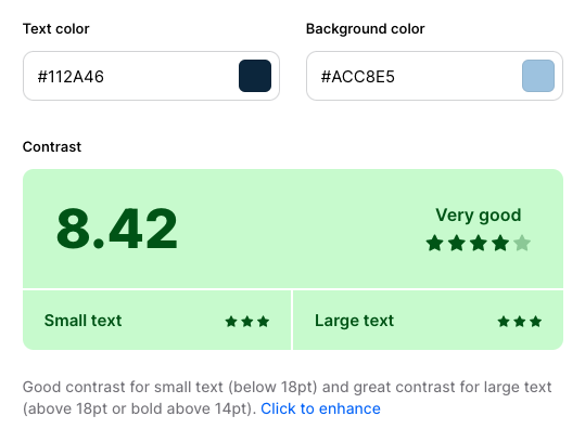
Now back to our regularly scheduled programming. Color contrast tools will fly in with instant contrast calculation, provide pass/fail indicators based on the WCAG requirements, and offer recommendations for improving color contrast with alternatives. Some color contrast checkers simulate the experience of individuals with various visual impairments, such as color blindness or low vision. Using color contrast tools in the design phase will save tons of time during the development and QA phase of your project before discovering that your primary and secondary colors don’t meet the minimum requirement. This means development presses on but your declared colors are going back to the design drawing board and this could ultimately slam the breaks on your project.

There are a multitude of contrast checkers online. Here’s my personal top 5 (in no particular order):

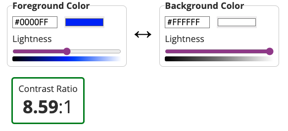
WebAIM’s Contrast Checker

WebAIM’s Contrast Checker is a bit of a gold standard but isn’t winning the key to the city due to its early aughts design. That being said, it gets the job done and it gets it done well. It allows users to input specific foreground and background colors and provides instant feedback on the contrast ratio. The results are displayed with clear pass/fail indicators based on WCAG color contrast requirements.

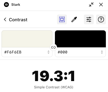
Stark

Stark's Chrome Color Checker Extension

Stark (no relation to Tony) is a popular design accessibility plugin that includes a color contrast checker among its features. It integrates with design software like Sketch, Adobe XD, and Figma, allowing designers to check color contrast directly within their design workflows. It’s also available as a Chrome extension. Stark provides real-time feedback on contrast ratios and compliance with accessibility standards. While it does offer suggestions for improving color contrast, this is a feature of the Pro version, which is $10 a month.

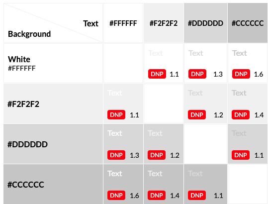
Eightshapes Contrast Grid

This color contrast grid is fire and a favorite on this list! 🔥 It can be a little intimidating at first but it’s actually super helpful. A major pro of this checker is because it’s a grid, you can test multiple colors at a time and each column and row intersection will provide a fail or level of accessibility indicator. You can test all your brand colors in one go! In the text box on the left side of the grid, you can change color hex values and names and they’ll appear in the grid.

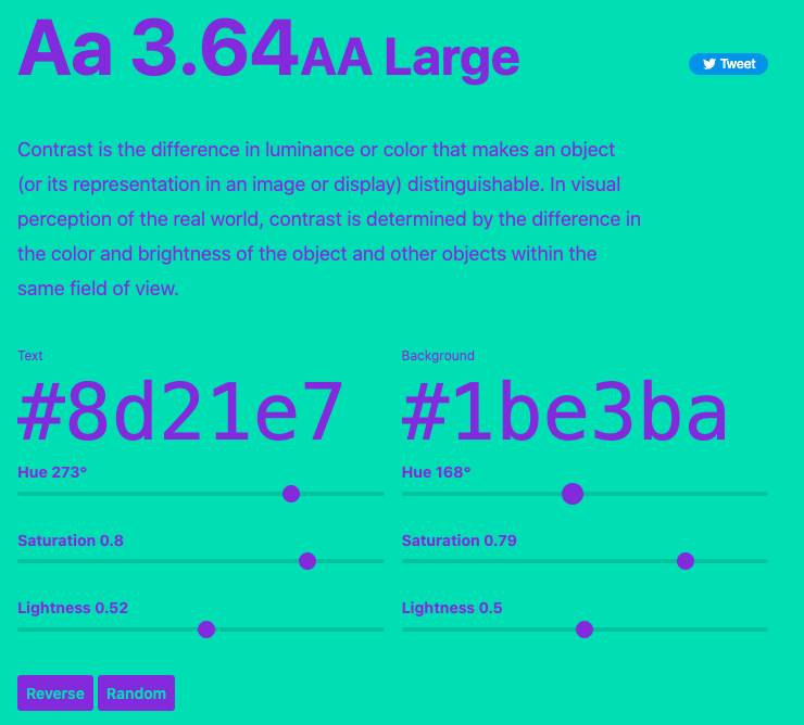
Colorable

Colorable's color contrast app

Colorable’s color contrast app will show you the contrast ratio value and accessibility level in real time as you slide the hue, saturation, and lightness ranges. This app features a reverse button that swaps out the background and text color and a randomizer button that will give you a random text and background color pair.

Coolors

Coolors' Contrast checker

Coolors’ Contrast checker is similar in functionality to Colorable with some super charged features. It offers a color picker you can use to pick any color from the page and gives a breakdown for both small and large text. Down side, it doesn’t show the accessibility level. Up side, Coolors will generate a fun, inspiring quote to illustrate what block text will look like with your chosen colors.

Power up with each of these and see which one suits your needs best. Think of different use cases and scenarios when testing for contrast. Boost your site for accessibility by covering all cases and various factors such as text size, background images, dynamic content, and error states. For example, make sure your text is readable and of the proper contrast when you have display text over an image, especially an image with a wide range of color variants.

To keep your accessibility skills razor sharp, it’s essential to stay on top of updates to the WCAG guidelines. The best resources for this is the Web Accessibility Initiative (WAI) and the WCAG official documentation. Be sure to revisit your contrast checker of choice to ensure continued compliance with evolving WCAG requirements.

By prioritizing accessibility and adhering to WCAG standards, we can build websites that are inclusive, user-friendly, and empower everyone to fully engage with the digital world.

Footnotes:
[1] Want to better understand the difference hue, saturation, and luminosity? This post by Amit Agarwal (@labnol) has the best explanation I’ve ever seen with a video by Bruce Gabrielle (@speakingppt)

Filed Under: Blog

Bankist App

June 19, 2023 by mcheow Leave a Comment

As part of my journey to become a better engineer, I’ve been taking a JS course that focuses on ES6+ new functions and concepts. Admittedly, I started this course awhile ago. Shortly thereafter, life, work, and a bout of burnout happened, but that’s another blog post.

I’ve rekindled my passion for learning and expanding my skill set. This banking app is the first one I’ve built in awhile. It’s built in JavaScript and uses various array and number methods, the date object, the Internationalization API, and setInterval.

The app uses dummy data populated via an object that contains transactions, dates, currency and locale.

The internationalization API was used to format the transactions, balance amounts, dates, and times based on the locale of the user set in the user objects.

setInterval was used to set a timer that logs out the user after being idle for five minutes. The setInterval clears when the user takes any action, including logging in as another user.

The focus of this app was purely for JavaScript practice, not styles so the app is not responsive.

You can see the app in action here and the git repo lives here.

To view the app, you can login with mc and the pin 1111. To see the localization working, you can view another user with the user name jd and the pin 2222.

More app builds to come!

Filed Under: Projects

Pikachu CSS Art

July 13, 2021 by mcheow Leave a Comment

I’ve seen tons of CSS Art floating around the internet for years. Recently, I stumbled upon this Medium article by Eva Lettner that inspired me to do this. Granted, it’s 4 years old but it’s still relevant. I figured I’d try my hand at it. Pikachu is made mostly with HTML and CSS3, lots of pseudo elements, a flex box wrapper, and some light JavaScript. This was my first pass at making CSS art and I’m kind of proud of this one. This wasn’t done via tutorial, just from scratch and modeled after an image. This project was interesting as it forced me to reevaluate the common ways I solve problems and think of alternatives to solutions. It also allowed me to be creative in a way that translating mockups to code doesn’t. Bonus: It was super fun and Pikachu came out adorable!

To view the CodePen click here

Filed Under: Projects

Vanilla JS Pig Game

July 13, 2021 by mcheow Leave a Comment

This project was one that came out of Jonas Schmedtmann’s Udemy course, the Complete JavaScript Course 2021. It involved a lot of DOM manipulation and click events. Most of which I already knew but I started this course to learn ES6 and beyond as well as some of the more advanced and nuanced aspects of the language.

Click here to view the project

Filed Under: Projects

  • 1
  • 2
  • 3
  • Next Page »
  • About
  • Portfolio
  • Projects
  • Blog
  • Connect

About MC

In west Brooklyn born and raised, behind a computer is where I spent most of my days. Codin' out all cool outside of the school.... ok I'm clearly not Will Smith.

In 2007, I got my start in web development, kept it going after college and I landed my first job at Marvel. Several years later, New York City and I developed a rocky relationship and we decided to call it quits. I set my eye on the west coast and landed in Vegas where I dug in deep with the tech scene; attending meetups and planned a few Startup Weekends.

A few years later, I bought a house, got married and planted some roots. Moving was the best decision I've ever made.

Resume

  • Download my resume in PDF format

Connect

  • twitter
  • linkedin
  • codepen
  • github
  • wordpress
  • stackoverflow
  • mail

© 2025 · Michele Cheow