You take The Emotion’s 1977 disco track “Best of My Love,” add a modern hip-hop twist, rap lyrics and you get Paul Russell’s viral banger “Lil Boo Thang.”
Take Grandmaster Flash & The Furious Five’s 1982 hit “The Message,” give it a 2023 Gen-Z spin sprinkled with synths, and you get Coi Leray’s feminist anthem “Players.”
The modernization of vintage art could be applied to just about anything. What immediately comes to mind is a new UI/UX design trend that’s taken the internet by storm, Neubrutalism. Seriously, it’s bigger than cats used to be (Cat videos on YouTube, not the musical).
Neubrutalism, or Neobrutalism, is a modern interpretation of Brutalism, an architectural style that gained popularity mid century, characterized by minimalist, plain, large-scale, rectangular shapes with an almost unfinished quality and lack of decoration or flourishes.
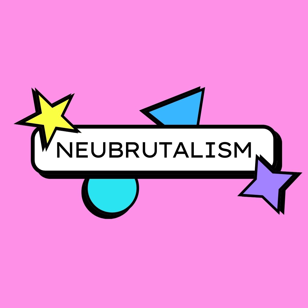
Neubrutalism on the web is striking and easily recognized. It feels modern and vintage at the same time. The user experience is flat with no gradients, using basic shapes, and often clashing colors.
Figma, Gumroad, and even Mozilla adopted this design movement. Even the fonts are similar. Look up the design trend on Dribbble and you will find rows and rows of mocks and graphics.
But instead of minimalist, these designs seem to go in the opposite direction, maximalist. A lot of animations, albeit subtle at times, a lot of large elements with a lot of loud colors that may not necessarily offer enough contrast in all instances. Fast moving news ticker banners are a commonly used element.
So this begs the question…is this ever growing design trend accessible?
As someone who identifies as neurospicy, I can only take Neubrutalism in small doses. At first, I thought these designs were novel and engaging. Five minutes later, I felt a migraine coming on. (I’m looking at you, Disco Conf)
I think the internet deserves better. Don’t you?

Leave a Reply