Michele Cheow

Turning caffeinated beverages into code since '07

  • About
  • Portfolio
  • Projects
  • Blog
  • Connect

WP-CLI: Not all dev tools wear capes

November 28, 2023 by mcheow Leave a Comment

If you’re a #WordPress developer, you’ve probably heard of WP-CLI, the command-line interface for WordPress. But what exactly is it? And why should you care? And did you know you can also use it locally?

WP-CLI is a tool that allows you to manage your WordPress sites from the command line. This means you can perform tasks like creating and updating posts, managing plugins and themes, and even backing up your site, all without having to log in to your dashboard.

So, why should you use WP-CLI?

It’s faster. It’s often faster than using the WordPress dashboard, especially for tasks that you repeat often.

It’s more powerful. It can do things that you can’t do with the dashboard, like managing your site’s .htaccess file or running scripts.

It’s more flexible. It can be used to automate tasks and integrate with other tools, making it a powerful tool for developers.

I recently started freelancing on a WordPress project and decided to try it out. Since I prefer to run WordPress locally on my machine and because my Mac is still kicking at 10+ years old, I went old school and used #MAMP. (Docker doesn’t work on older machines 😫).

I wanted to try running a search and replace on the imported database locally to find all instances of the staging url and replace it with my localhost url. Normally, I would use Migrate DB Pro, which handles this automatically but wanted to try a different method. WordPress plugins? Don’t know her. 😁

After installing, I navigated to the root level of my WP install, the same level as my wp-config file. I ran “wp option get siteurl” to test the correct url was getting returned and I got an error.

After reading through the WP-CLI docs, #StackOverflow, and general Googling, I found out that in your wp-config file, you need to add the port number to your database hostname.

Once that was done, I ran “wp search-replace ‘staging-url’ ‘localhost url'” and it worked like a charm. If you want, you can even target the search and replace to specific tables.

There are a ton of commands available, so it’s recommended to learn the basics before you can use it effectively.

There are a few great resources available for learning WP-CLI:

The official WP-CLI documentation: https://make.wordpress.org/cli/

The WP-CLI Cookbook: https://github.com/wp-cli/wp-cli

The WP-CLI Community: https://wordpress.slack.com/messages/C02RP4T41

WP-CLI is a powerful tool that can make life much easier. If you’re not already using it, I highly recommend that you give it a try!
Filed Under: Blog

The Neubrutalism Takeover

November 3, 2023 by mcheow Leave a Comment

You take The Emotion’s 1977 disco track “Best of My Love,” add a modern hip-hop twist, rap lyrics and you get Paul Russell’s viral banger “Lil Boo Thang.”

Take Grandmaster Flash & The Furious Five’s 1982 hit “The Message,” give it a 2023 Gen-Z spin sprinkled with synths, and you get Coi Leray’s feminist anthem “Players.”

The modernization of vintage art could be applied to just about anything. What immediately comes to mind is a new UI/UX design trend that’s taken the internet by storm, Neubrutalism. Seriously, it’s bigger than cats used to be (Cat videos on YouTube, not the musical).

Neubrutalism, or Neobrutalism, is a modern interpretation of Brutalism, an architectural style that gained popularity mid century, characterized by minimalist, plain, large-scale, rectangular shapes with an almost unfinished quality and lack of decoration or flourishes.

Neubrutalism on the web is striking and easily recognized. It feels modern and vintage at the same time. The user experience is flat with no gradients, using basic shapes, and often clashing colors.

Figma, Gumroad, and even Mozilla adopted this design movement. Even the fonts are similar. Look up the design trend on Dribbble and you will find rows and rows of mocks and graphics.

But instead of minimalist, these designs seem to go in the opposite direction, maximalist. A lot of animations, albeit subtle at times, a lot of large elements with a lot of loud colors that may not necessarily offer enough contrast in all instances. Fast moving news ticker banners are a commonly used element.

So this begs the question…is this ever growing design trend accessible?

As someone who identifies as neurospicy, I can only take Neubrutalism in small doses. At first, I thought these designs were novel and engaging. Five minutes later, I felt a migraine coming on. (I’m looking at you, Disco Conf)

I think the internet deserves better. Don’t you?

Filed Under: Blog

Unleashing the Power of Color Contrast Checkers

July 25, 2023 by mcheow

Your Secret Weapon for Achieving WCAG Superhero Status

Web accessibility is all about ensuring equal access to information on the web for individuals with disabilities. WCAG (Web Content Accessibility Guidelines) standards play a crucial role in achieving this by providing guidelines for designing and maintaining accessible websites. Here, we’ll zero in on one major aspect of accessibility when it comes to high fidelity designs, color contrast.

Color contrast refers to the difference in hue, saturation, or luminance[1] between two elements, such as text and its background. It provides visual clarity and legibility, allowing people with various degrees of low vision, color blindness, or other visual impairments to perceive and comprehend information effectively. As it’s an often overlooked aspect of web design, it’s important to keep this in mind when declaring your primary, secondary, and tertiary colors in your style guide.

Enter color contrast checkers, the unsung heroes of WCAG compliance. These neat little tools have the power to ensure that everyone can access and navigate websites with ease. In this action-packed article, we’ll unveil the hidden secrets of color contrast checkers and show you how to become an accessibility champion!

Before our tools swoop in for the rescue, let’s add in a little context in understanding WCAG Color Contrast Guidelines. The requirements are categorized into three levels: Level A, Level AA, and Level AAA. Level AA is considered the standard for most websites and is widely adopted to meet basic accessibility standards. However, when you suit up with Level AAA, you’ll gain a higher level of accessibility, which is recommended for situations where maximum accessibility is desired. The two most common WCAG success criteria related to color contrast are 1.4.3 Contrast (Minimum) and 1.4.11 Non-text Contrast.

The WCAG success criterion (1.4.3) focuses on the minimum contrast ratio between text and its background. It sets a standard for ensuring that text content maintains sufficient contrast with the background color to be easily readable. The contrast ratio is calculated based on the relative luminance of the foreground (ie: text) and background colors. The minimum contrast ratio required for Level AA compliance is 4.5:1 for normal text and 3:1 for large text (typically above 18pt or 14pt, if bolded).

WCAG success criterion (1.4.11) addresses the contrast between non-text elements, such as icons, graphical symbols, or user interface components, and their background. Non-text elements often serve important functional or navigational purposes, and sufficient contrast is necessary to make them discernible and understandable. This criterion ensures that non-text elements have a contrast ratio of at least 3:1 with their adjacent background. However, there are exceptions for decorative graphics that don’t convey information or don’t receive user input.

Now back to our regularly scheduled programming. Color contrast tools will fly in with instant contrast calculation, provide pass/fail indicators based on the WCAG requirements, and offer recommendations for improving color contrast with alternatives. Some color contrast checkers simulate the experience of individuals with various visual impairments, such as color blindness or low vision. Using color contrast tools in the design phase will save tons of time during the development and QA phase of your project before discovering that your primary and secondary colors don’t meet the minimum requirement. This means development presses on but your declared colors are going back to the design drawing board and this could ultimately slam the breaks on your project.

There are a multitude of contrast checkers online. Here’s my personal top 5 (in no particular order):

WebAIM’s Contrast Checker

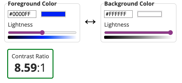
WebAIM’s Contrast Checker is a bit of a gold standard but isn’t winning the key to the city due to its early aughts design. That being said, it gets the job done and it gets it done well. It allows users to input specific foreground and background colors and provides instant feedback on the contrast ratio. The results are displayed with clear pass/fail indicators based on WCAG color contrast requirements.

Stark

Stark's Chrome Color Checker Extension

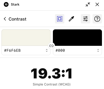
Stark (no relation to Tony) is a popular design accessibility plugin that includes a color contrast checker among its features. It integrates with design software like Sketch, Adobe XD, and Figma, allowing designers to check color contrast directly within their design workflows. It’s also available as a Chrome extension. Stark provides real-time feedback on contrast ratios and compliance with accessibility standards. While it does offer suggestions for improving color contrast, this is a feature of the Pro version, which is $10 a month.

Eightshapes Contrast Grid

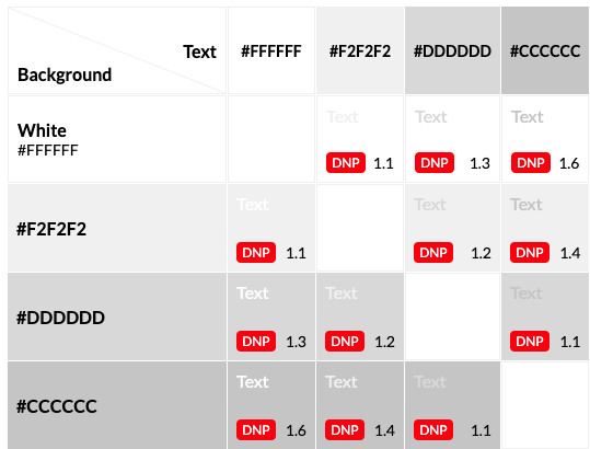
This color contrast grid is fire and a favorite on this list! šŸ”„ It can be a little intimidating at first but it’s actually super helpful. A major pro of this checker is because it’s a grid, you can test multiple colors at a time and each column and row intersection will provide a fail or level of accessibility indicator. You can test all your brand colors in one go! In the text box on the left side of the grid, you can change color hex values and names and they’ll appear in the grid.

Colorable

Colorable's color contrast app

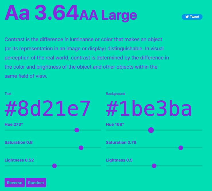
Colorable’s color contrast app will show you the contrast ratio value and accessibility level in real time as you slide the hue, saturation, and lightness ranges. This app features a reverse button that swaps out the background and text color and a randomizer button that will give you a random text and background color pair.

Coolors

Coolors' Contrast checker

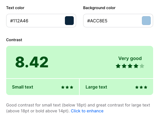
Coolors’ Contrast checker is similar in functionality to Colorable with some super charged features. It offers a color picker you can use to pick any color from the page and gives a breakdown for both small and large text. Down side, it doesn’t show the accessibility level. Up side, Coolors will generate a fun, inspiring quote to illustrate what block text will look like with your chosen colors.

Power up with each of these and see which one suits your needs best. Think of different use cases and scenarios when testing for contrast. Boost your site for accessibility by covering all cases and various factors such as text size, background images, dynamic content, and error states. For example, make sure your text is readable and of the proper contrast when you have display text over an image, especially an image with a wide range of color variants.

To keep your accessibility skills razor sharp, it’s essential to stay on top of updates to the WCAG guidelines. The best resources for this is the Web Accessibility Initiative (WAI) and the WCAG official documentation. Be sure to revisit your contrast checker of choice to ensure continued compliance with evolving WCAG requirements.

By prioritizing accessibility and adhering to WCAG standards, we can build websites that are inclusive, user-friendly, and empower everyone to fully engage with the digital world.

Footnotes:
[1] Want to better understand the difference hue, saturation, and luminosity? This post by Amit Agarwal (@labnol) has the best explanation I’ve ever seen with a video by Bruce Gabrielle (@speakingppt)

Filed Under: Blog

Scrolling on iOS

May 24, 2021 by mcheow Leave a Comment

This was not a fun bug to encounter the weekend right before a deadline. I was building a fixed position date picker at the bottom of the viewport on mobile devices. It has a click event listener on it that triggered the opening of a modal which contained the flatpickr calendar. The issue was when the user scrolled, the modal wouldn’t open. The modal would only open on load.

The element on Android was behaving as expected (of course); however, iOS was another story. Using a combination of lambatest.com and browserstack.com, I tested on the latest iOS devices and several older models.

The calendar behavior and appearance was set to trigger on resize to toggle between the desktop version and mobile version of the calendar. As it turns out, iOS has a “feature” when the user scrolls, it triggers a resize event.

I discovered this jQuery solution on stackoverflow:

// Store the window width
let windowWidthResize = $(window).width();

// Trigger Resize Event
$(window).resize(function () {

        // Check window width has actually changed and it's not just iOS triggering a resize event on scroll
        if ($(window).width() != windowWidthResize) {

            // Update the window width for next time
            windowWidthResize = $(window).width();

            // Run Mobile detect function
            detectMobileForBBModal();
        }        
});

The first line initializes a variable that stores the width of the window. The next line adds the resize event listener. The conditional checks if the window width has not changed by comparing it to width variable. If the width has not changed, the new width after resize gets assigned to the variable then you can run your function or whatever it is you want to do.

The stack overflow posting was answered 7 years ago. At the time of this writing, scrolling on iOS, version 14.5.1, still fires a resize event. I have yet to determine if this is a feature or a bug.

Filed Under: Blog Tagged With: bugs, development, iOS

Gulp 4 Starter Project

July 7, 2020 by mcheow Leave a Comment

If you’re looking for a Gulp 4 starter so you can get going fast on your new project, I’ve created one.

It comes packaged with with a gulp watch task that runs browser sync once initialized. It contains a font task that gets run with the default gulp task.

The folder structure for this starter project should be as follows:

/app
  /fonts
  /js
  /scss
gulpfile.js
index.html
package.json
package-lock.json

Running the default gulp task will create your dist folder.

Filed Under: Blog

The NPM Rabbit Hole

April 4, 2017 by mcheow Leave a Comment

My M.O. in web development is “When it doubt, panic.” Exactly, what I did a few minutes ago before writing this.
While setting up a local WordPress install, I ran into an error message, produced when I tried to run an ‘npm’ command. After googling every error message I ran into, I finally resolved it. Here’s how:

My first issue began when I ran ‘npm install’ and got this error message:
SyntaxError: Use of const in strict mode.
I followed the second set instructions here: http://stackoverflow.com/questions/22603078/syntaxerror-use-of-const-in-strict-mode as they were concise and easy to follow. Not knowing exactly what a “helper” is and while in a panic thinking I’ve hosed my setup, I ran the command.

I then upgraded node to v7.8.0 hoping that would fix it but I was met with a new round of errors instead:
npm Error: invalid version install
Now, I was certain I was making the situation worse.

I tried going back into my theme and running npm there when I was met with:
Cannot find module 'internal/fs'
After searching, I found this: https://github.com/npm/npm/issues/14232 where I got the impression I should downgrade Node.

Next, I searched how to remove node and reinstall it. I found this where I followed the first poster’s set of instructions: http://stackoverflow.com/questions/11177954/how-do-i-completely-uninstall-node-js-and-reinstall-from-beginning-mac-os-x

I ran
npm -v and saw 3.10.10

I took note of the progress and allowed myself to calm down a little.

npm install gulp ran smoothly except for a warning message to update graceful-fs as soon as possible. However, when I ran the gulp command, I saw this: -bash: gulp: command not found

This time stackoverflow helped me out big time with this gem: http://stackoverflow.com/questions/25090452/gulp-command-not-found-after-install
I ran npm config set prefix /usr/local, went back to my theme and ran gulp

Just when you think you’ve solved it…
Run `npm rebuild node-sass` to build the binding for your current environment.
I ran the command, ran gulp and… Viola Davis!

Problem solved! Such a relief I can work again!

This post was mainly to gloat over my small victory but also as a reminder to myself to breathe when I run into problems.

Filed Under: Blog

Sass + WordPress

September 10, 2016 by mcheow Leave a Comment

If you’re new to Sass, or Syntactically Awesome Style Sheets, it can be intimidating to think about what might be involved in setting up a Sass site. However, once you learn how to do it, your styles will be cleaner, more organized and far easier to maintain. The advantages are many. What we’ll be doing here is converting a plain CSS WordPress theme to a Sass theme.

If you’re working on a PC, openĀ Open Command Prompt, run `cmd` to start this project. From here on out, the instructions will be for Mac users but it will only vary when it comes to Command vs. Terminal usage.

If you’re working on a Mac, to get started, openĀ Terminal which is found in yourĀ Utilities folder.


Install Gulp

Gulp is a build runner for development. It can do many things like compress js, css and image files, check for js errors, also called ā€œlinting,ā€ as well as compiling sass, which is what we’re about to use it for now.
In order to install Gulp, first you must have node.js installed, which can be downloaded here: Nodejs.org

After installing Node, you’ll need to install Gulp by running this command in Terminal:
sudo npm install gulp -g

Take note that only Mac users need to use the sudo keyword because they need admin rights to install Gulp globally, which is what the -g indicates in the command. Installing Gulp globally gives you the freedom to run it anywhere on your computer. The npm in the command indicates that we’re using Node Package Manager to install Gulp.

Now, we’re ready to set up a Gulp project!


Set up a Gulp Project

Since I’m converting a pre-existing css theme to sass, I’m going to navigate into my theme folder using Terminal.

If you’re not familiar with basic commands use cd, which means change directory, so your command might look something like this:
cd Documents/Websites/site.dev/wp-content/themes/sometheme

Once inside your theme, run:
npm init

This command creates a package.json file, which stores all of your project’s information.

You’ll then be notified that the utility is going to prompt you through the creation of your json file:

json_prompt

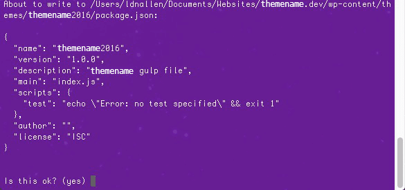
After you’ve been taken through all the prompts, your terminal window should look something like this, where you’ll confirm the file:

json_confirm

Once the json file is created, run:
npm install gulp --save-dev

Since we’re not installing it globally, the -g and sudo aren’t necessary in this case. The --save-dev adds gulp as a dev dependency in our newly minted package.json.
If you take a look in your package.json inside of your theme, you’ll notice that these lines were added to the file:

json_devdependencies

If you notice in the root of your theme, there’s a new folder called ā€œnode_modulesā€ that contains the gulp folder.


Folder Structure

In order to properly set up your folder structure, it’s best to think about what would work best for you before diving in. As a suggestion, start by creating an assets folder inside your theme. Assets will contain folders titled sass, which contains main sass files and partials, js-src which contains development js files and js, which contains the minified versions of the js files stored in js-src.

For an alternate folder structure example, take a look at this CSS-Tricks’ post, which separates the development files from the optimized files into separate folders at the theme’s root: Gulp for Beginners.


Set up Your Gulpfile.js

Create a new file called gulpfile.js and save it in the root of your theme’s folder.
Enter this line of code into your newly created js file:
var gulp = require('gulp');

By declaring this variable, we tell Node to look for the gulp package inside the node_modules folder.

With our new gulp variable, we can set up gulp tasks, like so:

gulp.task('task-name', function () {
    return gulp.src('source-files') // Get source files with gulp.src
    .pipe(aGulpPlugin()) // Sends it through a gulp plugin
    .pipe(gulp.dest('destination')) // Outputs the file in the destination folder
})

Task-name is where you’d place the name of the task to be run in the command line. In this case, you could run gulp task-name in the command line to run that task. gulp.src shows the task what files to use and gulp.dest shows where to output the files once the task has been run successfully. aGulpPlugin will be explained in the next section where we start compiling.


Compiling with Sass

Now, we’re going to add a plugin called gulp-sass into our theme. To do this, just run the npm install command like we did with gulp earlier.
npm install gulp-sass --save-dev

Be sure to use --save-dev in your command to add gulp-sass to devDependencies in your package.json file.

In your gulpfile.js, add a sass variable. The syntax looks like this:

var gulp = require('gulp'),
    sass = require('gulp-sass');

While this method of structuring the variables can be put up to debate, these variables are not going to be edited that much. If this were any other kind of js file, it’s best to write out each var.

Create your sass gulp task, which will look like this:

 
gulp.task('sass', function () {
    return gulp.src('source-files') // Get source files with gulp.src
    .pipe(sass()) // Sends it through a gulp plugin
    .pipe(gulp.dest('destination')) // Outputs the file in the destination folder
})

Take note that the aGulpPlugin placeholder from earlier was replaced with sass, as that is the gulp plugin we’re using in this case.

In order for the task to work, let’s add a source file and a destination.

To start, open your theme’s pre-exising style.css file, copy its contents and paste it into a new file, then delete the original file. Don’t worry. You have a backup to copy and paste from to your new sass files. The theme I’m working on is a genesis theme so if you are too, you’ll want to make sure your theme declaration gets maintained in your main scss file so that should be the first thing you bring over to the new sass file you’re about to create.

Create a style.scss file in the assets/sass folder, which will be added to the sass task in the gulp.src part of the return statement. We want to output the style.css file to the root of your theme’s folder, which would be the destination for gulp.dest. The end result for your sass task would look like this:

gulp.task('sass', function () {
    return gulp.src('./assets/sass/style.scss')
    .pipe(sass()) // Converts Sass to css with gulp-sass
    .pipe(gulp.dest('./'))
})


Globbing in Node

Partials, as mentioned earlier, are chunks of sass that make keeping your files cleaner and more organized. You can have separate .scss files for each site section, such as header, footer, navigation, main content area and even for specific pages. Partials also make style selectors and declarations easier to find based on their naming conventions. For instance, _header.scss or _footer.scss.
Setting up sass partials starts with learning about globbing. Globs are like regular expressions except their main purpose is looking for file path patterns:

  1. *.scss: The * pattern is a wildcard that matches any pattern in the current directory. In this case, we’re matching any files ending with .scss in the sass folder.
  2. **/*.scss: This is a more extreme version of the * pattern that matches any file ending with .scss in the root folder and any child directories.
  3. !not-me.scss: The ! indicates that Gulp should exclude this pattern from the results. In this case, not-me.scss would be excluded from the match.
  4. *.+(scss|sass): The plus + and parentheses () allows Gulp to match multiple patterns, with different patterns separated by the pipe | character. In this case, Gulp will match any file ending with .scss or .sass in the root folder.

In order to set up sass partials, we’ll need to replace the ./assets/sass/style.scss src in our sass gulp task with ./assets/sass/**/*.scss, so in using the 2nd pattern from above our task now looks like this:

gulp.task('sass', function () {
    return gulp.src('./assets/sass/**/*.scss')
    .pipe(sass()) // Converts Sass to css with gulp-sass
    .pipe(gulp.dest('./'))
})


Watching Sass Files

So we don’t have to run ā€œgulp sassā€ every time we make a style change, we can use Gulp’s watch method. The syntax for that looks like this:
gulp.watch('files-to-watch', ['tasks', 'to', 'run']);

In order to watch your sass files, add this line to your gulpfile:

gulp.task('watch' function(){
    gulp.watch('./assets/sass/**/*.scss',['sass']);
})

To test this is working, go to Terminal and type in gulp watch. You can see that each time you save your sass file, the sass task runs automatically. To end the gulp session and return to the prompt, hit Control + C. To get real fancy, you can add a live reload function called Browser Sync that will refresh your browser with each change. That’s up next, stay tuned!


Live Reload

Browser Sync loads up a web server that helps with live-reloading.
To install Browser Sync, go to your Terminal and type in this command:
npm install browser-sync --save-dev

You’ll need to require browser-sync in your gulpfile.js, so your declared variable section should now look like this:

var gulp = require('gulp'),
    sass = require('gulp-sass');
    browserSync = require('browser-sync').create();

Declare a devURL variable at the very top of your gulpfile as you’ll need it for the next step. This variable stores the url for your local developer environment:
var devUrl = 'https://sitename.dev/';

Be sure to replace sitename.dev with your local url.

Now add this new Browser Sync task to the end of your gulpfile:

gulp.task('browserSync', function() {
    var files = [
        '**/*.php',
        '**/*.{png,jpg,gif,svg}'
    ];

    browserSync.init(files, {
        proxy: {
            target: devUrl,
        }
    });
})

Here, the proxy is telling Browser Sync to look for an an already existing site and in this case it’s my desktop server install.
Next, we’ll need to add some code to our sass task, using the pipe method which is a way of chaining multiple tasks together. This allows Browser Sync to inject the css into the browser whenever the task runs:

gulp.task('sass', function(){
    return gulp.src('./assets/sass/**/*.scss')
    .pipe(sass()) // Converts Sass to css with gulp-sass
    .pipe(gulp.dest('./'))
    .pipe(browserSync.reload({
        stream: true
     }))
})

Instead of awkwardly opening two terminal tabs to run gulp browserSync in one and gulp watch in the other, let’s make it so we’ll only need to enter one command that will run both tasks. In order to do that, we’ll need to add 2 more arguments to the watch task:

gulp.task('watch', ['browserSync', 'sass'], function(){
    gulp.watch('./assets/sass/**/*.scss', ['sass']);
})

What goes inside the square brackets is an array of tasks to complete before watch runs. Sass will need to run before watch so the CSS will be the latest whenever we run the Gulp command. If you go to the terminal now and run gulp watch, both the sass and browserSync tasks will run and then watch will begin once those two have completed. A browser window will appear that will pull up your local instance and each time a style change is made, the browser will refresh automagically.


Partials

The last part of this project will involve breaking out the sections from the main stylesheet into sass partials. A partial is a way of creating modular code where multiple files are created and then compiled into one. You can separate many lines of styles into several easily digestible files, which leads to clean code. When naming partials, start with an _. This flag alerts Sass that the file is only a partial, which should be compiled into style.css and not generate a new stylesheet. With this naming convention, an example of a sass file name would be _header.scss.

Edit your style.scss to include the theme’s name, description, author uri, version and template, which can be copied from your theme’s original stylesheet.

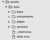
Create a new sass partial called _reset.scss, which is where all of your reset styles will go. This file will live at the root of the sass folder at the same level as style.scss.

Next you’ll want to define a sass file structure. Add folders for base, components, sections and pages inside of assets/sass.

Open your style.scss file and enter @import "base/base"; and do this for each of your partial folders. This tells Sass to look inside your base folder for a file called _base.scss. Inside _base.scss, enter @import ā€œlayoutā€; and add an import for each file inside of base. Repeat this process for the rest of your partials.

When complete, your file structure will look like this:

sass_file_structure
Inside of the base folder, create the following files:

  • _base.scss (This file includes the @imports to include the following partials)
  • _buttons.scss (Contains all of your button styles)
  • _forms.scss (Contains all of your form styles)
  • _layout.scss (Contains any structural styles)
  • _lists.scss (Contains all of your list styles)
  • _tables.scss (Contains all of your table styles)
  • _typography.scss (Contains all styles that handle font families, font color, weight and size)


Inside of the components folder, create the following files:

  • _components.scss (This file includes the @imports to include the following partials)
  • _breadcrumbs.scss (Contains all of your styles for breadcrumb links)
  • _columns.scss (Contains all of your column width styles)
  • _comments.scss (Contains all of your comment form/section styles)
  • _forms-gravity.scss (Contains all of your style specifically for gravity forms)
  • _forms-misc.scss (Contains all of your miscellaneous form styles)
  • _navigation.scss (Contains all styles associated with your theme’s navigation)
  • _pagination.scss (Contains all styles associated with your theme’s pagination)
  • _widgets.scss (Contains all widget title and content styles)
  • _wp-objects (Contains styles for objects, like embed, iframe, img and WP classes, like .alignright, .avatar, etc)


Inside of the sections folder, create the following files:

  • _sections.scss (This file includes the @imports to include the following partials)
  • _content.scss (Contains styles for anything styling the main content, such as entry titles and featured content)
  • _footer.scss (Contains all styles for the main site footer)
  • _header.scss (Contains all styles for the main site header)
  • _sidebar.scss (Contains styles for general sidebar styles)


Inside of the pages folder, create the following files:

  • _pages.scss (This file includes the @imports to include the following partials)
  • _404.scss (Includes all 404 page specific styles)
  • _author.scss (Includes all styles controlling the author archive page)
  • _category.scss (Contains all styles for the category archive page)
  • _front-page.scss (Contains styles for the front page)
  • _page.scss (Contains generic page styles)
  • _single.scss (Includes styles for single posts)


Break out your original stylesheet by copying and pasting into the partials you created and be sure to nest your style declarations where possible. What nesting is and how to do that are covered in the next section.


Nesting

One of the best parts of Sass is the ability to nest css declarations, another feature that keeps your styles clean and organized. Nesting allows you to place children within the brackets of the parent’s selector, which might look something like this:

.widget {
    padding: 1.5em;
    margin-bottom: 1em;
    width: 100%;
    h4 {
       font-size: 2em;
       color: #3d3d3b;
       text-transform: capitalize;
    }
}


Version Control

A note about working with sass files under version control; it’s best to stop Gulp from running before you check out other local branches. Otherwise, gulp will continue to run and may cause conflicts. In order to do this, you can close the Terminal window or hit Ctrl + C to return to your starting prompt.


Go Get Sassy!

While this tutorial only scratched the surface of what Gulp and Sass have to offer, it’s a fairly good place to start with just the basics, especially if you’re brand new to it.Ā There isn’t one way to set up gulp so you’ll need to explore and experiment to find what works best for you and your projects. Gulp offers many packages such as sourcemaps, which helps with debugging, phpcs, a php code sniffer, and svg-sprite,Ā optimizes and turns svgs into sprites. These 3 are just a fraction of what Gulp can do, so take a look atĀ npmjs.comĀ to learn more. For more on Sass, hit up the Sass website. And when you become a total fanboy or girl, get some Sassy stickers!

Filed Under: Blog

  • About
  • Portfolio
  • Projects
  • Blog
  • Connect

About MC

In west Brooklyn born and raised, behind a computer is where I spent most of my days. Codin' out all cool outside of the school.... ok I'm clearly not Will Smith.

In 2007, I got my start in web development, kept it going after college and I landed my first job at Marvel. Several years later, New York City and I developed a rocky relationship and we decided to call it quits. I set my eye on the west coast and landed in Vegas where I dug in deep with the tech scene; attending meetups and planned a few Startup Weekends.

A few years later, I bought a house, got married and planted some roots. Moving was the best decision I've ever made.

Resume

  • Download my resume in PDF format

Connect

  • twitter
  • linkedin
  • codepen
  • github
  • wordpress
  • stackoverflow
  • mail

© 2025 Ā· Michele Cheow